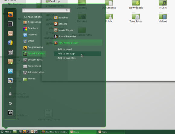
Though Cinnamon comes with a settings tool you can not yet customize it to the fullest. This is because it still is under heavy development and it is even not yet recommended to create super-creative themes, since it is likely that functions will be altered or added in the near future.
Nevertheless, I have searched the cinnamon.css file (the file that is responsible for most stylistic issues of cinnamon) of the current version 1.3.1 for the classes that have to be altered to change the basic interface elements, the panel, and the menu. The file you need is /usr/share/cinnamon/theme/cinnamon.css. Color values are given in hexadecimal codes (e.g. #FF0000) or in RGB values plus transparency (e.g. (255,255,255,0.5). Color can easily be converted to the other format using graphics software such as Pinta - just use the software's color picker to choose a color and then copy and paste the code, or insert a code to get the other. If two colors are given in the form of a gradient, there is a color flow between the two given colors.
Note: Before you make any changes to your cinnamon.css, make sure you have made a backup copy and know how to use it without a proper user interface since one faulty character in the file could render cinnamon completely unable to start. The best way to save yourself then is to have another desktop such as GNOME 3 installed to be able to switch to it in the worst case (use ctrl + alt + backspace to log out)
Note2: Changes only apply after restarting Cinnamon.
Panel:
- To change the panel's color, search the file for the #panel class and change the background-color value.
- To change the unfocused panel buttons' colors, search the file for the .window-list-item-box class and edit the background-gradient-start and background-gradient-end values. Start marks the button's top whereas end marks the button's bottom.
- To change the focused panel buttons' colors, search the file fo the .window-list-item-box:focus class and edit the background-gradient-start and background-gradient-end values. Start marks the button's top whereas end marks the button's bottom.
- To change the button border color of the two above possibilities, change the box-shadow value in the same classes.
Menu:
- To change the menu's color, search for the .popup-menu-boxpointer class and edit the arrow-background-color value
- To change the menu border's color, search for the arrow-background-color class and edit the arrow-border-color value
- To change the category menu's selector box, search for the .menu-category-button-selected class and change the background-gradient-start and the background-gradient-end values
- To change the application menu's selector box, search for the .menu-application-button-selected class and change the background-gradient-start and the background-gradient-end values
- To change the application submenu's selection box color, search for the .popup-menu-item:active class and edit the background-color value
- To change the border color of the two above possibilities, change the box-shadow value in the same classes.
- To change the favorites menu's background color, search for the .menu-favorites-box class and edit the background-gradient-start and background-gradient-end values.
- To change the favorites menu's border color, change the border value in the same class as above
- To change the favorites menu's selection box color, search for the .menu-favorites-button:hover class and edit the background-gradient-start and background-gradient-end values.
- To change the scrollbar handle's color, search for the StScrollBar StButton#vhandle class and change the background-color value
- To change the scrollbar border's color, edit the border value in the same class as above
To change the menu's texts, there is usually a value called color inside the appropriate classes which handle the text color. Also, the other possibilities can easily be identified by the classes' and values' names.
